


Unlike Apple Maps, Google Maps can tell you when a restaurant, bar, club, or other business you're thinking of visiting is busy. It's extremely helpful if you want to avoid peak times or wait for the place to be empty. If you can't pry yourself away from using Apple Maps, there's an easy alternative to see the popular times of most businesses.
Google collects anonymous user data via its mobile apps on Android and iOS to populate visit information for business listings. This aggregated data is thanks to users who've opted into Google Location History and Location Reporting on their Google account, and it helps build graphs to show popular times, live visit information, wait times, and even typical visit durations.
Apple was rumored to be working on a similar feature, but nothing has materialized yet that rivals Google's live visit data for businesses and places of interest.
Use Google Maps
Visit data is available for business listings in Google Maps, the default navigation app for most Android phones. It also happens to be the top navigation app for iPhone in Apple's App Store. Use the links below to install or update the app to the most recent version.
If you want to see visit data for a business before going out, you don't have to pull out your smartphone. Instead, you can use Google Maps' desktop web app on your computer. This method also works via desktop.
Viewing a Location's Popular Times, Live Visit Data, and More
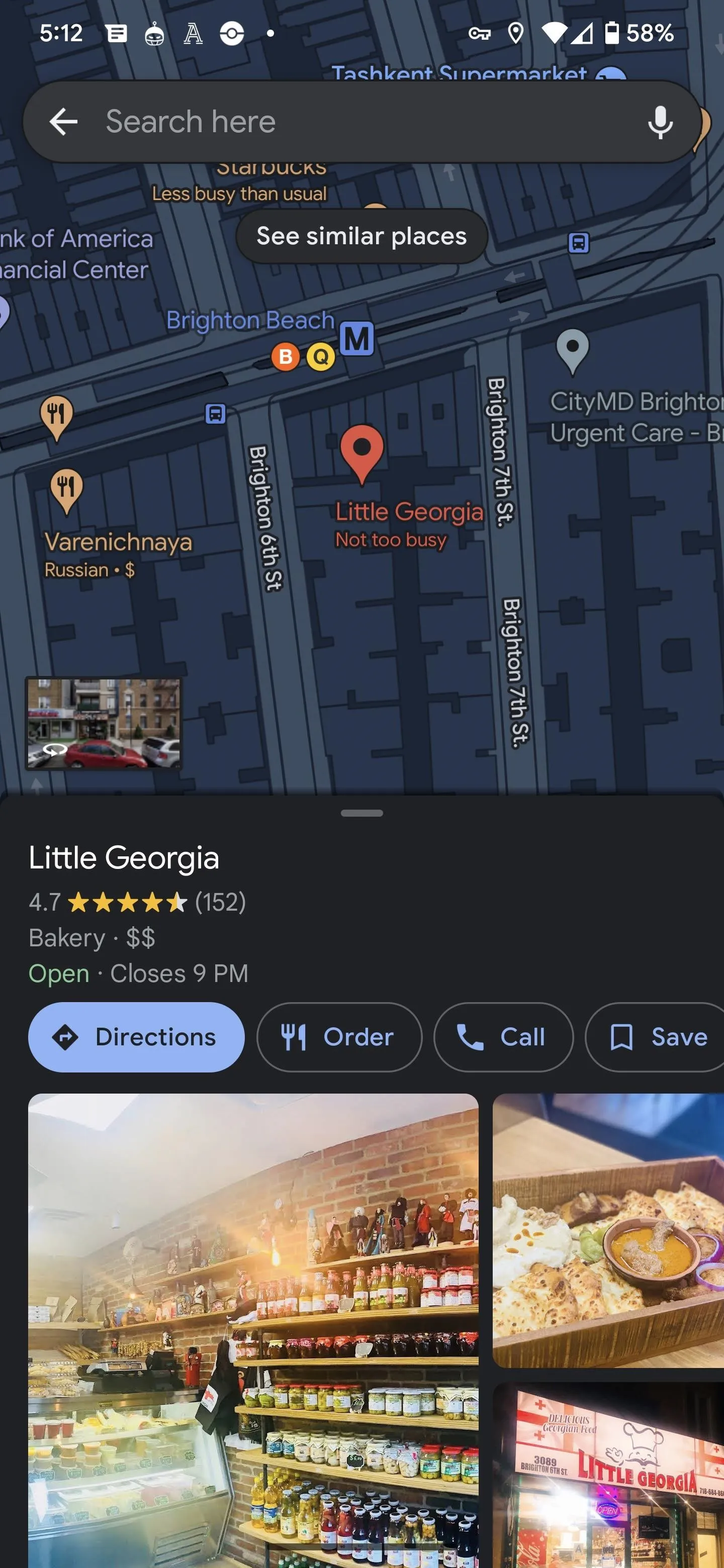
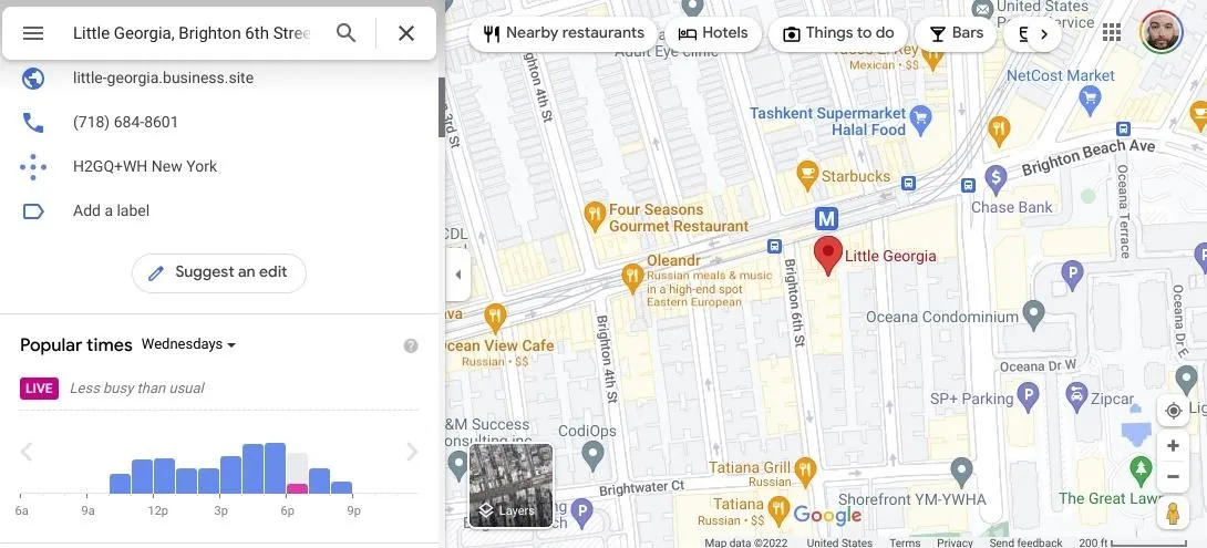
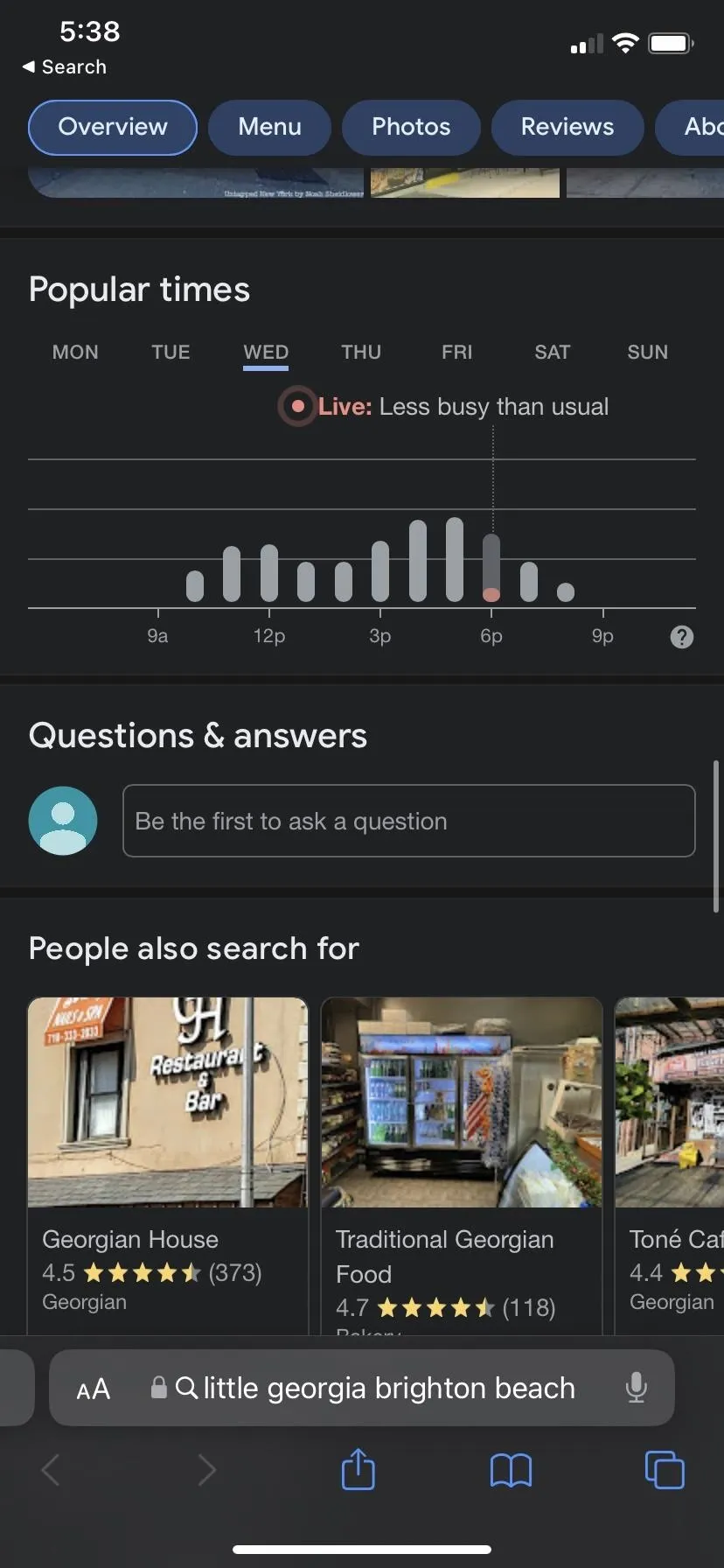
With Google Maps open, search for the location you'd like to evaluate or browse for it on the map. An info card for the site will appear at the bottom of the screen. Swipe up to access the full card, and keep scrolling until you find the popular times section.
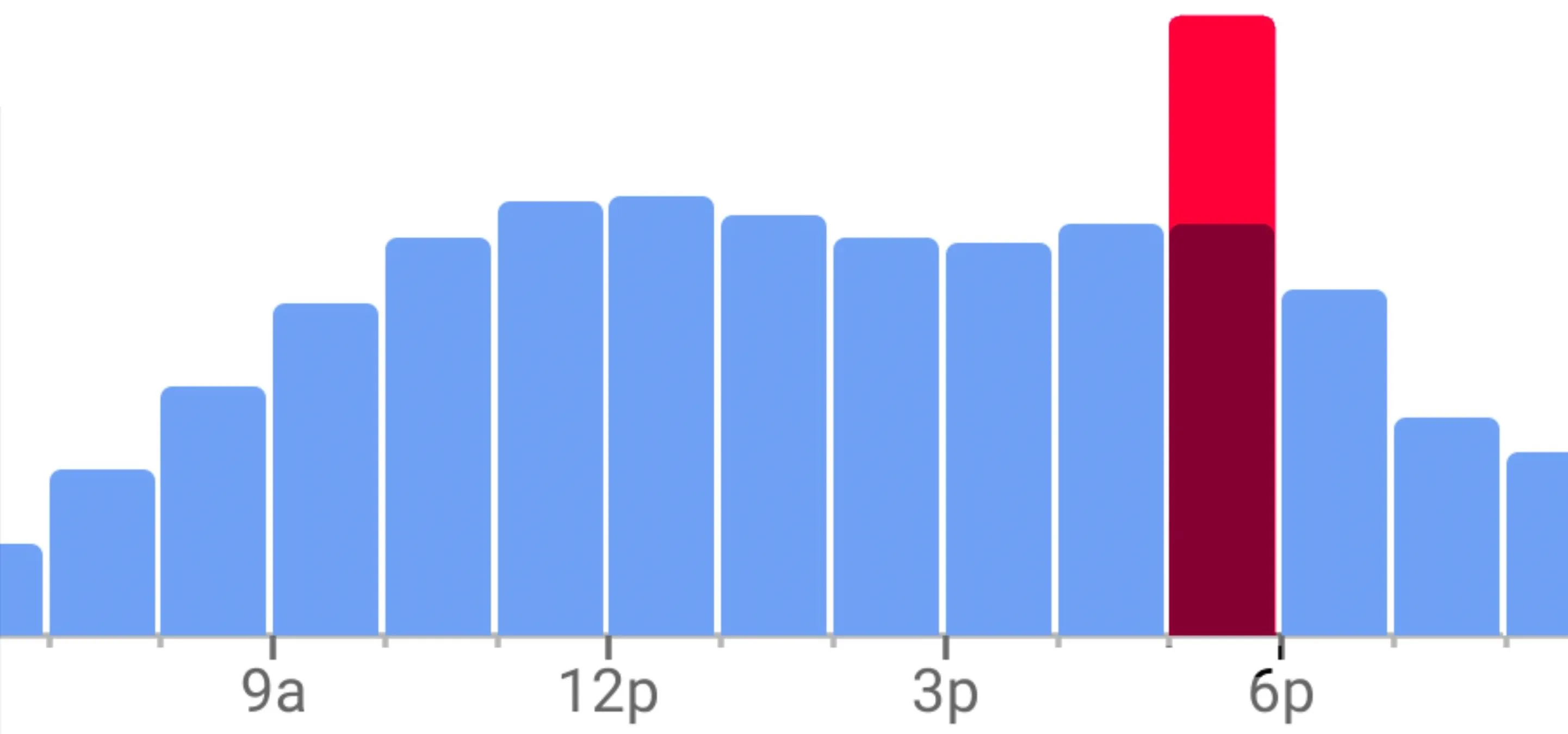
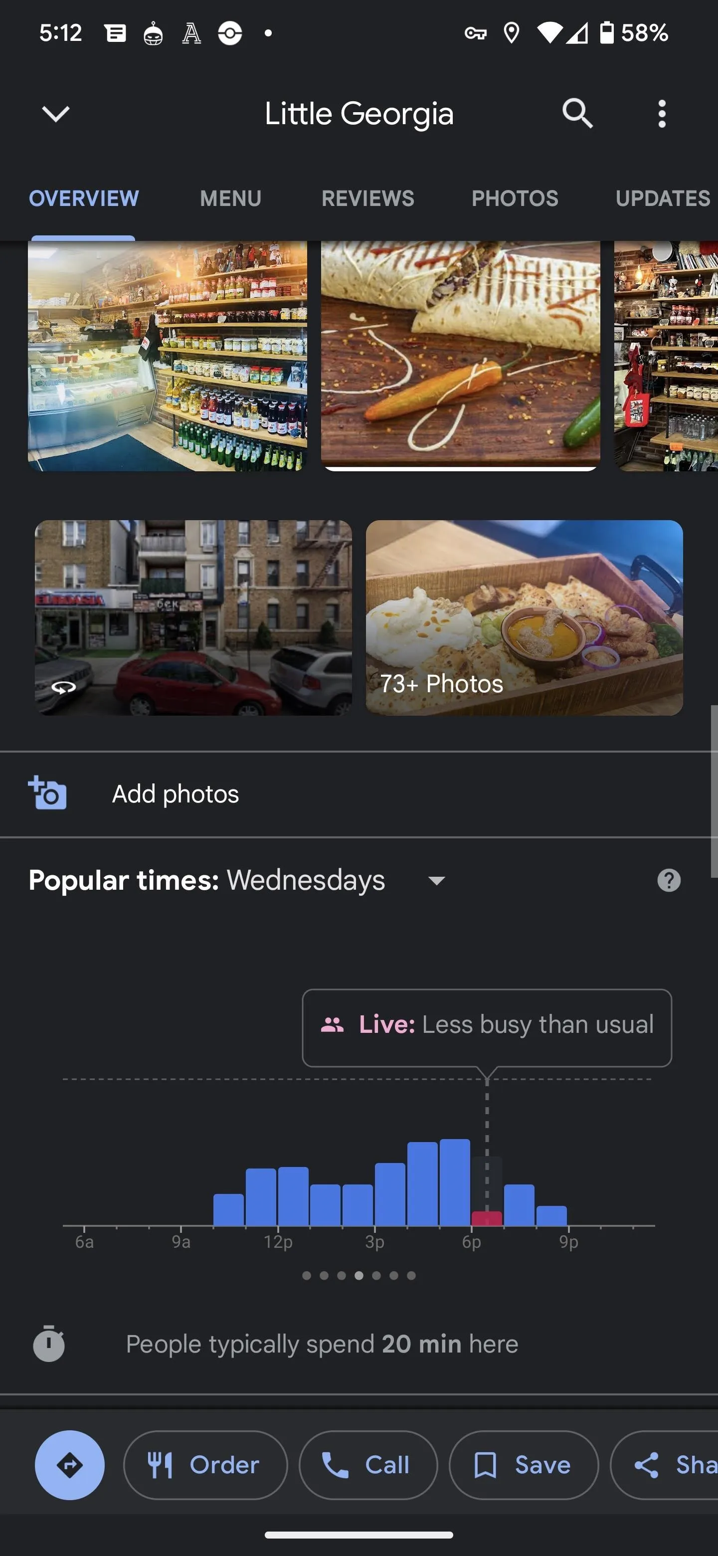
Based on historical data, the graph shows how busy the place is on a typical day using a bar chart. According to Google, the times are based on the average popularity over the last few months. If live visit data is available, you'll see the current time highlighted in red or pink, showing how active the location is compared to its regular popularity at that time.
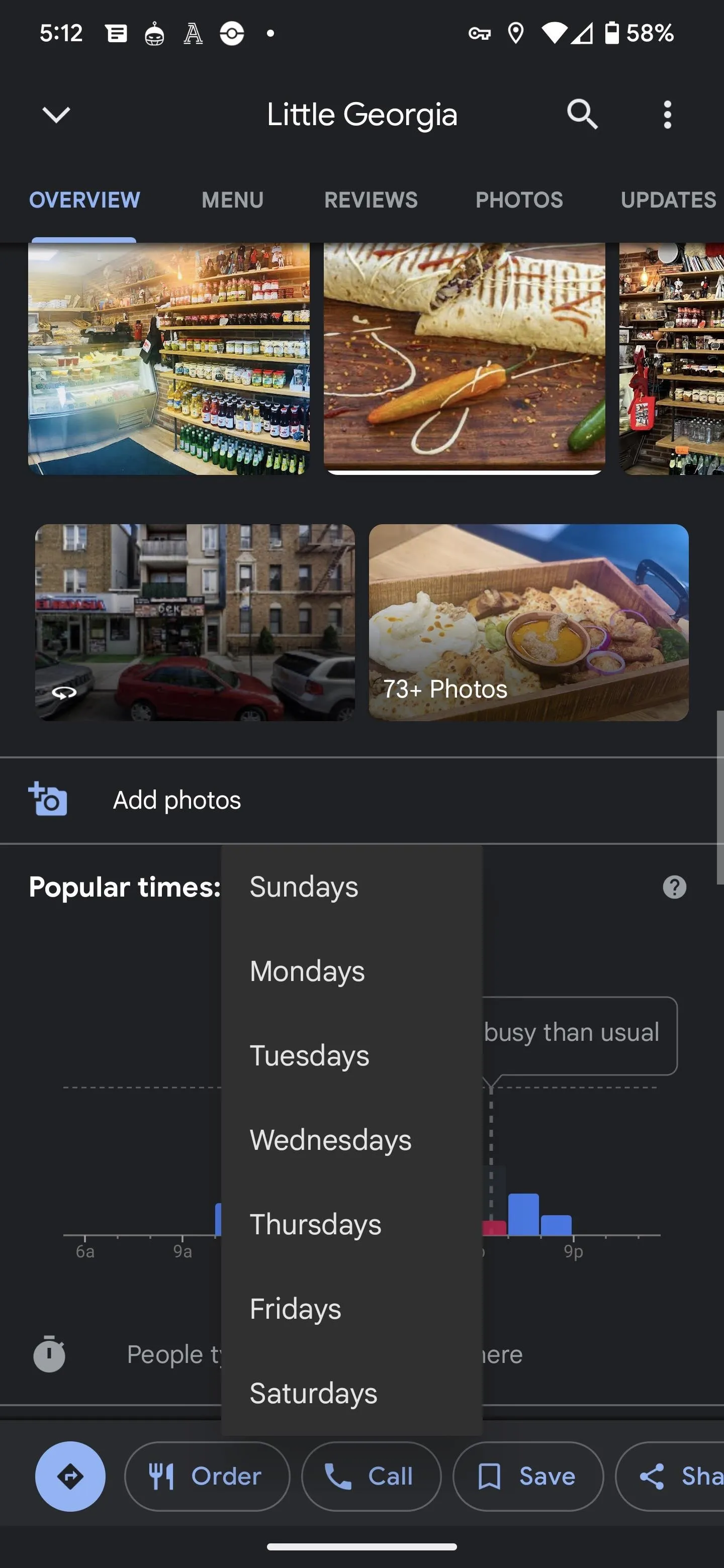
You can tap on any time bar to get a brief description of the time's popularity or live status, such as "usually not too busy" or "less busy than usual." And if you're planning your visit for a different day of the week, tap the current day to select a different one from the day selector.
Below the graph, you may also see information on the typical visit duration and wait time estimates, both based on patterns from the last several weeks. The wait time shows the general length of time a customer would wait before receiving service, along with the peak wait time for that day.
The process is similar on the desktop website, except the card will remain on the left side of the page with the map filling the remainder.
Viewing an Area's Popular Times, Live Visit Data, and More
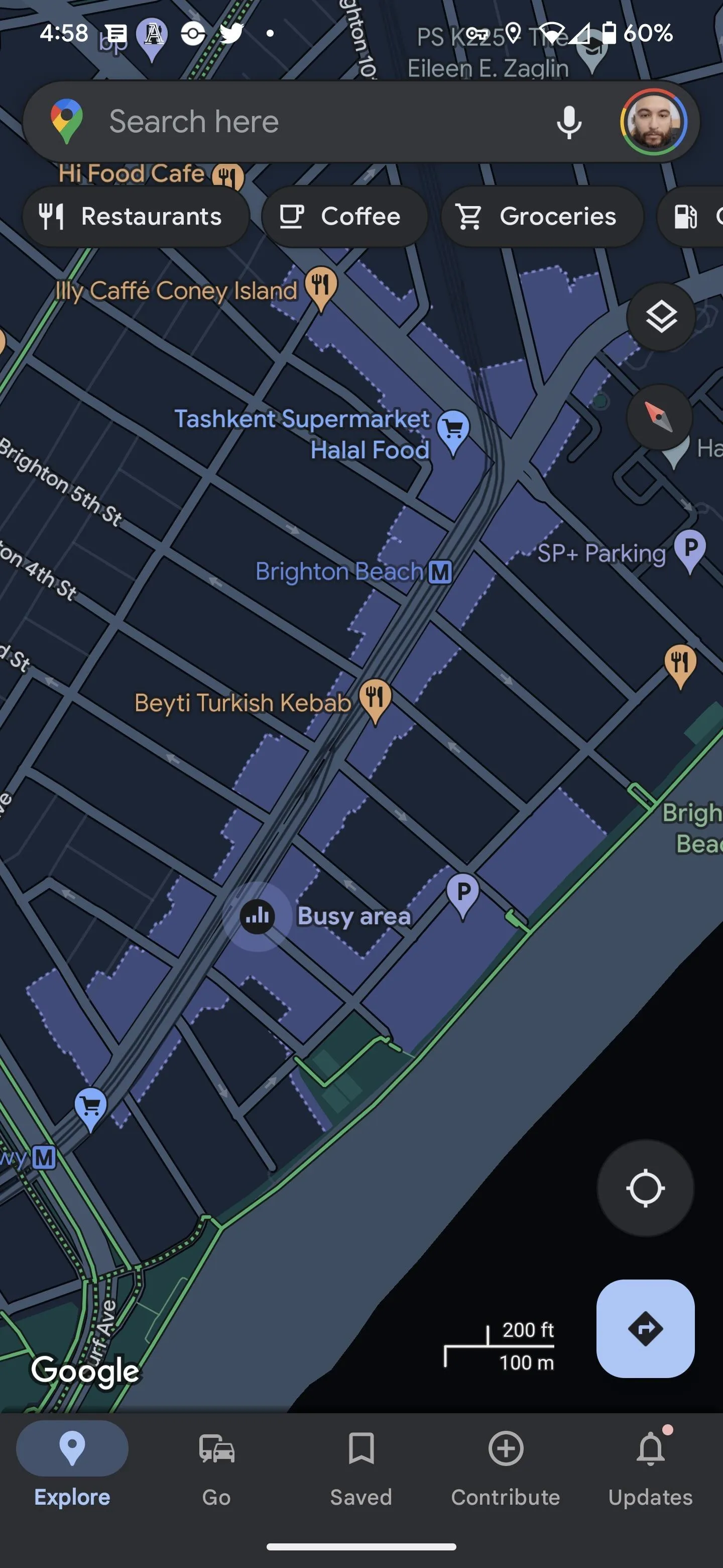
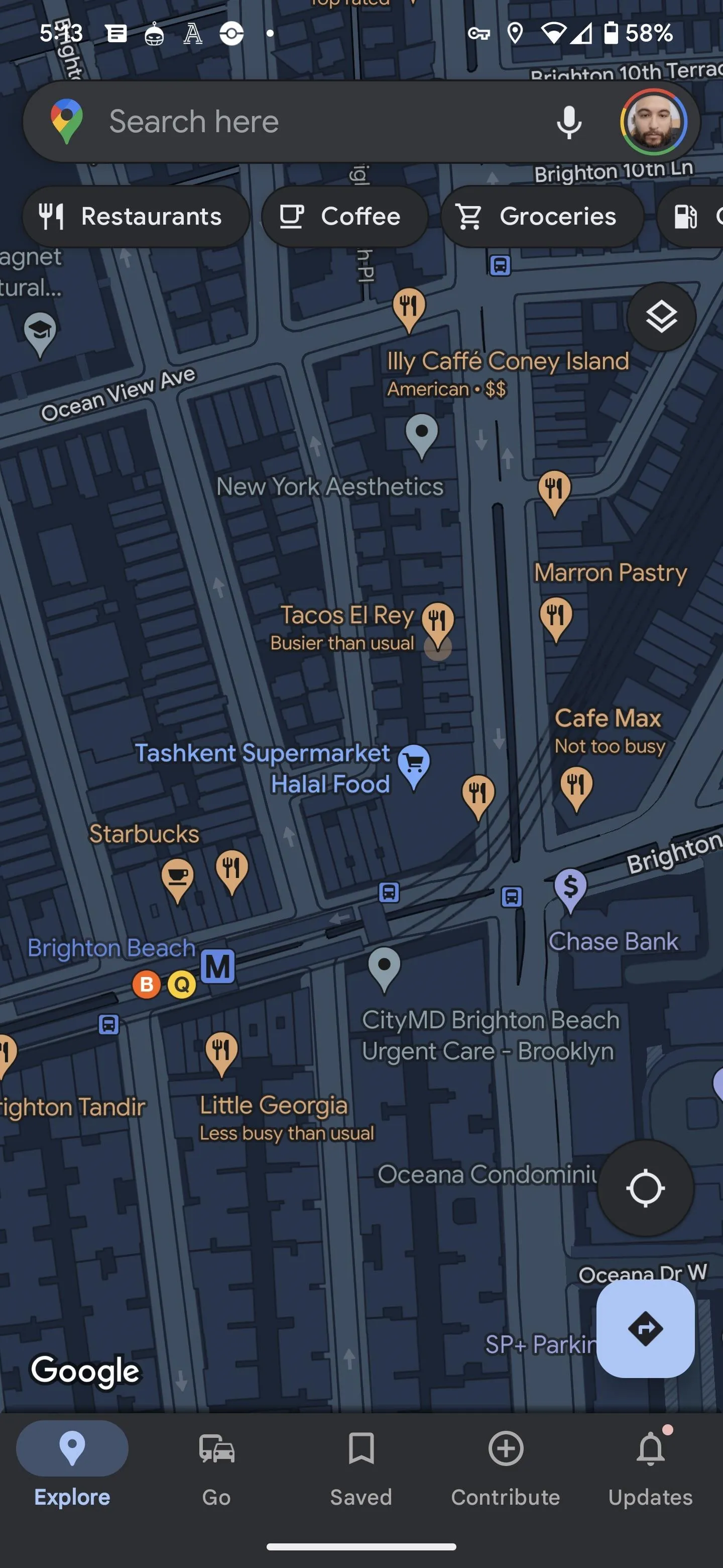
If you don't have a specific destination but want to discover how busy the nearby area is, you can browse the mobile app's map view for an overview of the area. The map will denote if particular districts are busy and will often include an evaluation of popularity with location labels. Oddly, this view is not available on the desktop website.
Use Google Search
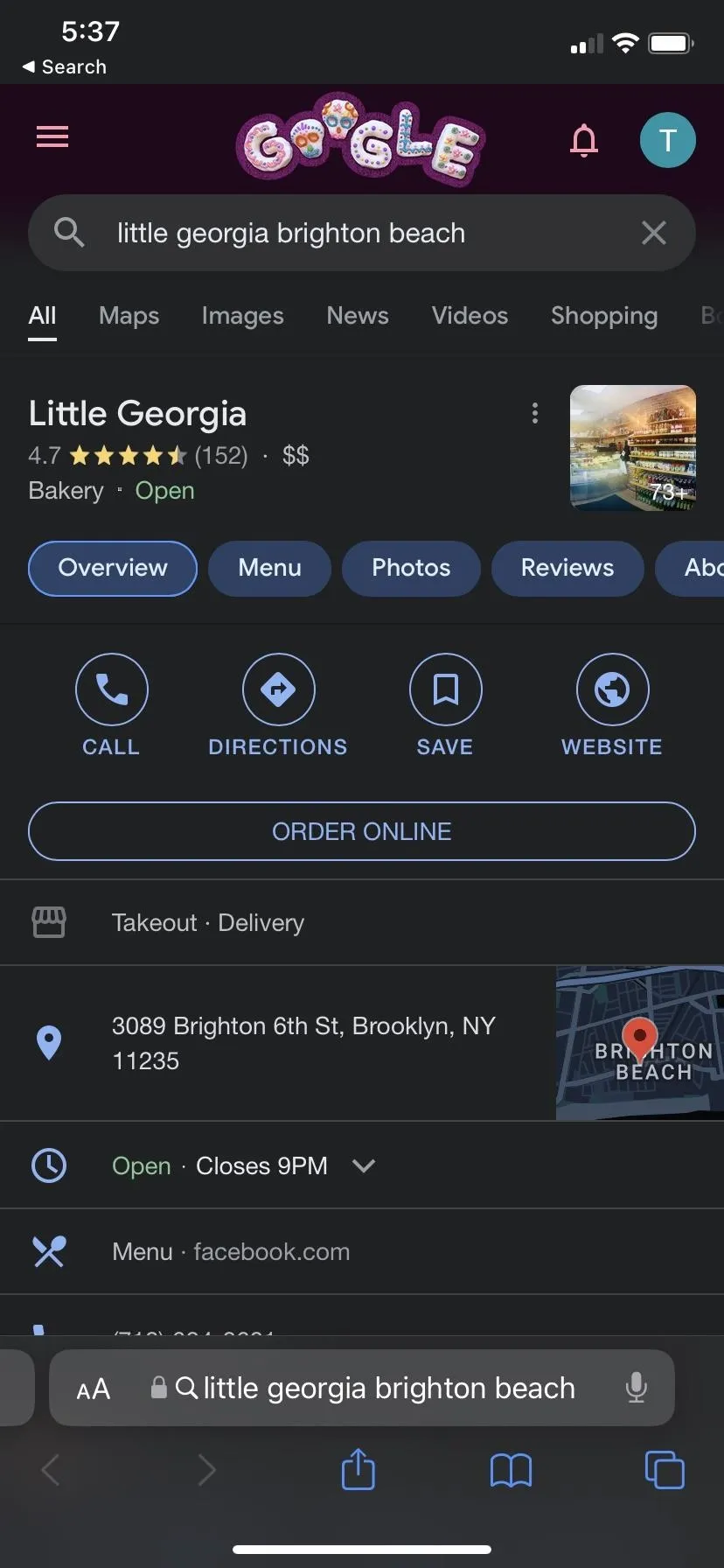
If Google Maps is not your preferred mapping app, fire up your default web browser or the Google app for Android or iOS and search Google for your destination. Look for the info card for the location and make sure the "Overview" tab is highlighted.
Next, scroll down until you find the popular times card. Compared to the Google Maps app, you'll have to scroll further to get past other search results, but you'll get there eventually. Once there, you'll see a similar bar chart to that above, depicting the popularity throughout the day, with the peak time obvious.
You'll see some of the same data available in Google Maps, but it may look slightly different. The bar chart will have thinner bars, and there will be tabs for the days instead of a day selector menu. You may or may not see data points for typical visit duration, wait time estimates, and peak wait times.
Cover image and screenshots by Tommy Palladino/Gadget Hacks


Comments
Be the first, drop a comment!