You can never replace the skills and expertise of a professional graphic designer, but Canva comes pretty damn close. It's ridiculously easy to use the drag-and-drop design tool for both professionals and people like me who don't have the need (or knowledge required) to use more advanced graphic design software.
Canva initially launched as a website but released a full-featured mobile app for Android and iOS after. Everything is created by dragging and dropping various elements which can be adjusted and customized to your liking. With thousands of templates to choose from, you can create everything from posters and ads to YouTube thumbnails and social media covers, all from the palm of your hand.
Some of Canva's most popular designs include posters, banner ads, Instagram posts, Pinterest posts, Twitter posts, infographics, wedding invitations, resumes, business cards, photo collages, and email headers. So it's a powerful tool, but it's effortless to use.
Before You Begin
Canva is free to use, though some features only work in the Canva for Work plan, which provides additional benefits, including unlimited storage, access to 400,000 image assets, custom dimensions, transparent designs, and priority support.
You can test Canva for Work with a 30-day free trial, after which it's $12.95/month or $119.40 ($9.95/month) if you pay for the year up front. I've found that the free plan is more than enough for most design tasks, so that's the one I'll be using today.
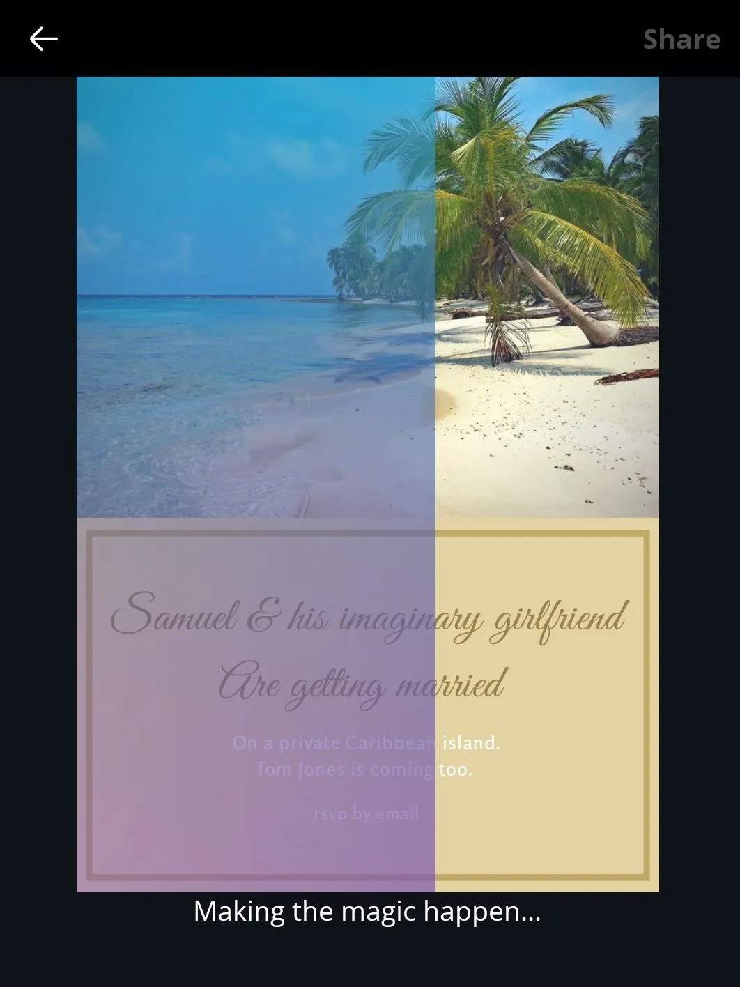
For this guide, I'll be creating an imaginary wedding invitation. I've already created my imaginary wife, and I've decided that we're going to get married on a private island in the Caribbean. There will be unlimited Rum and Jerk Chicken for all, and Tom Jones will be dropping by to sing a few tunes at the end of the night.
Before we start, you'll need to download the app, of course. Check out the links below and let's get started.
Select a Design Template
When you first launch the app, you'll be prompted to create an account, so sign up with an email address or your Facebook login to begin. From there, you'll have the option to create something from scratch or select from one of Canva's thousands of ready-to-edit templates, listed across multiple categories, including:
- Blogging & eBooks
- Documents
- Education
- Events
- Inspirations
- Marketing Materials
- Planners & Schedules
- Social Media & Email Headers
- Social Media Posts
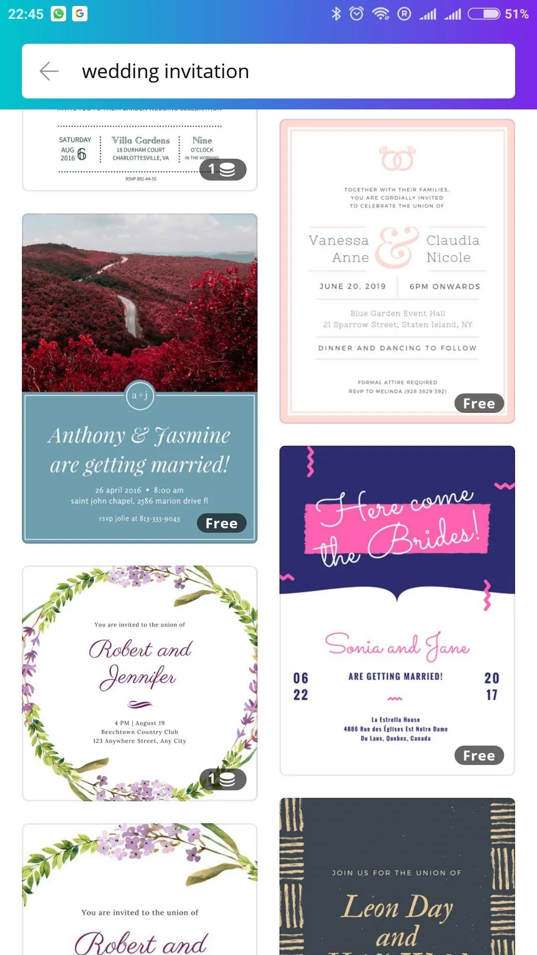
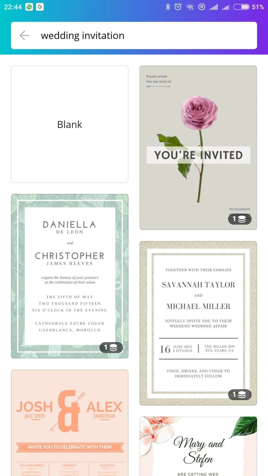
You can use the search box to find a specific template — my search for "Wedding Invitation" resulted in plenty of viable options, though Canva's drag-and-drop functionality is interchangeable, so feel free to search for something else.


Customize Text
Once you've found the right template for your design, you can edit or add additional elements by tapping the + button. Layers, which stack upon one another, sort the individual components. You can adjust the order and transparency by selecting an element and tapping the ellipsis menu button; Reposition by dragging with your finger, and resize by dragging from one of the corner points.
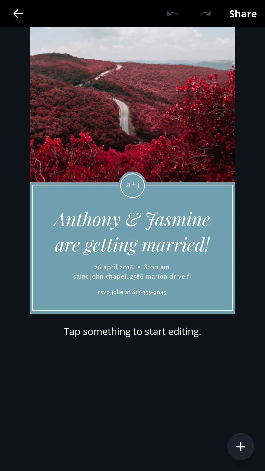
Below, you'll see the wedding invitation template I selected. It's nice and clean, with suitable space for imagery, but those trees aren't exactly suited to the whole Caribbean vibe I'm going for. Also, I'm neither Anthony nor Jasmine. Let's fix that.
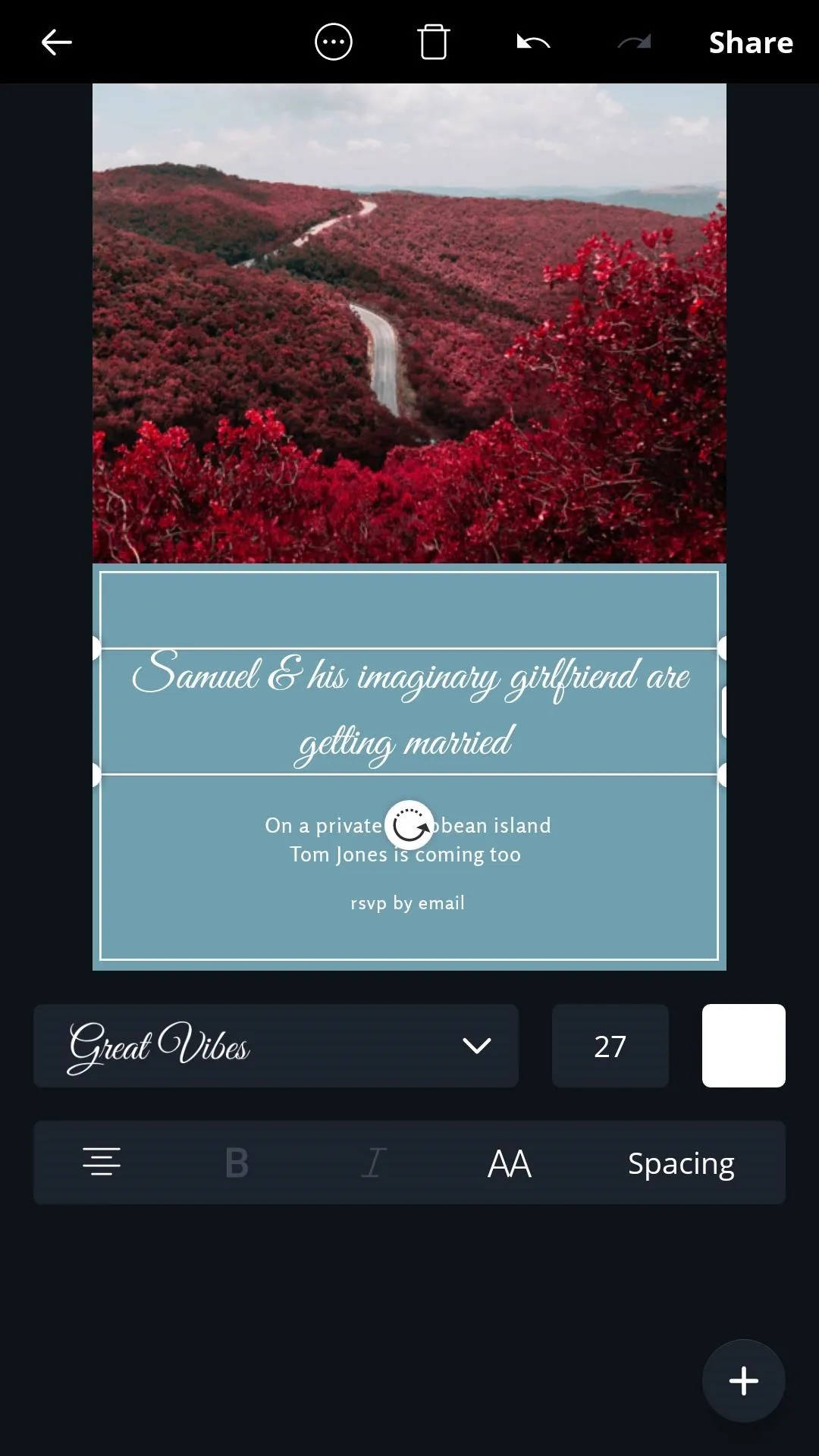


Thankfully, working with text couldn't be easier. With a single tap, you can edit and change the font size, type, and color.
After adding my name and other relevant details, I changed the font and deleted the smaller circular element and text in the center of the design by selecting it and pressing the trash icon.
Add an Image
To replace or add a picture, either tap the plus sign on the lower right or tap an existing image for the following set of menu buttons to appear:
- Gallery: Allows you to choose an image from your device or snap a picture on your phone's camera to be added to the design.
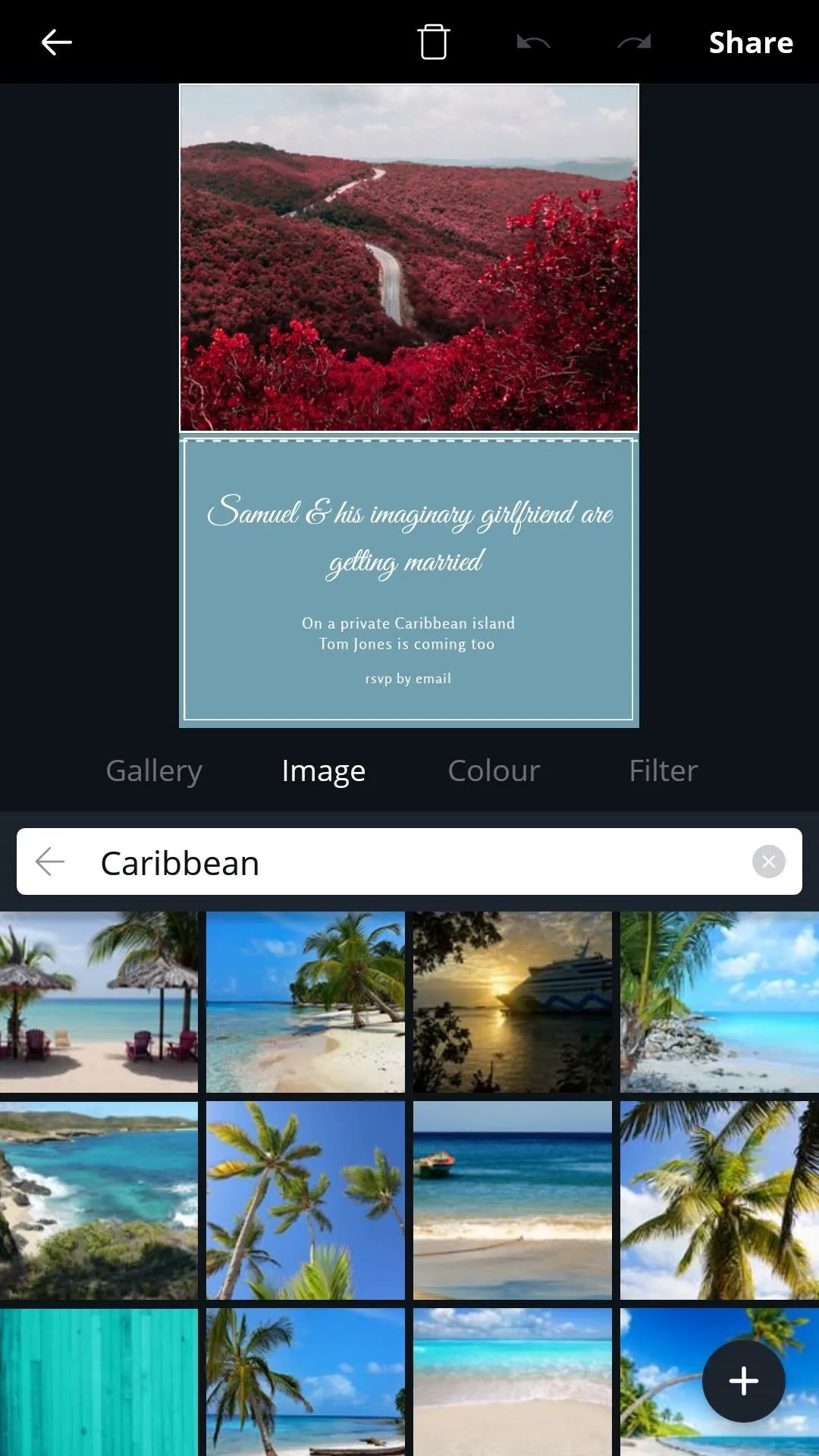
- Image: Type a keyword and search through Canva's expansive library of stock imagery
- Color: Choose a solid color as a backdrop.
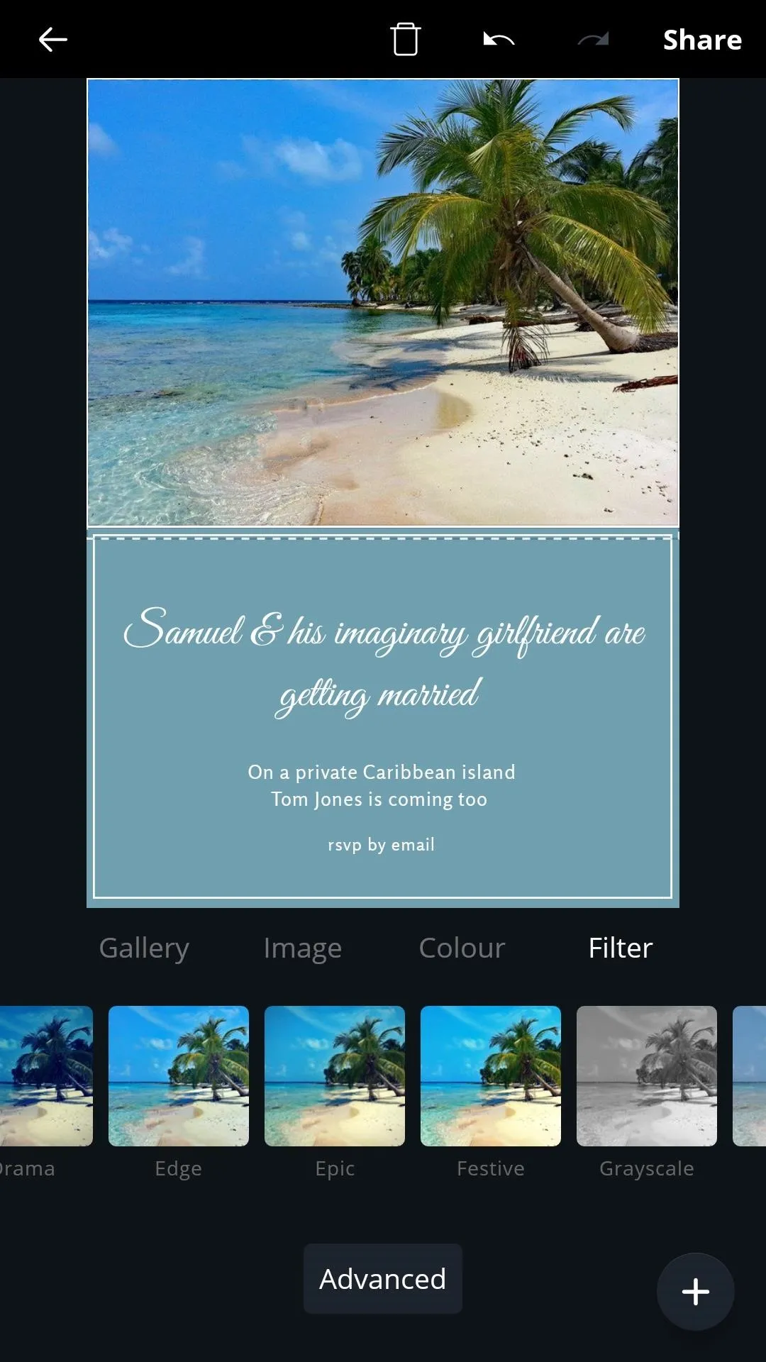
- Filter: Apply custom filters and adjust image settings for the selected image.
In this case, we'll select the Image tab to search through Canva's library for an appropriate picture. I found the perfect one for my invitation by searching for Caribbean. Once you've selected the best image for your design, you can pinch and drag to crop and apply a filter if you wish.


Choose Your Colors
Customize your template's color palette by tapping an element and selecting the color box. I went for mainly gold and sand-like colors to complement the picture of my tropical beach.
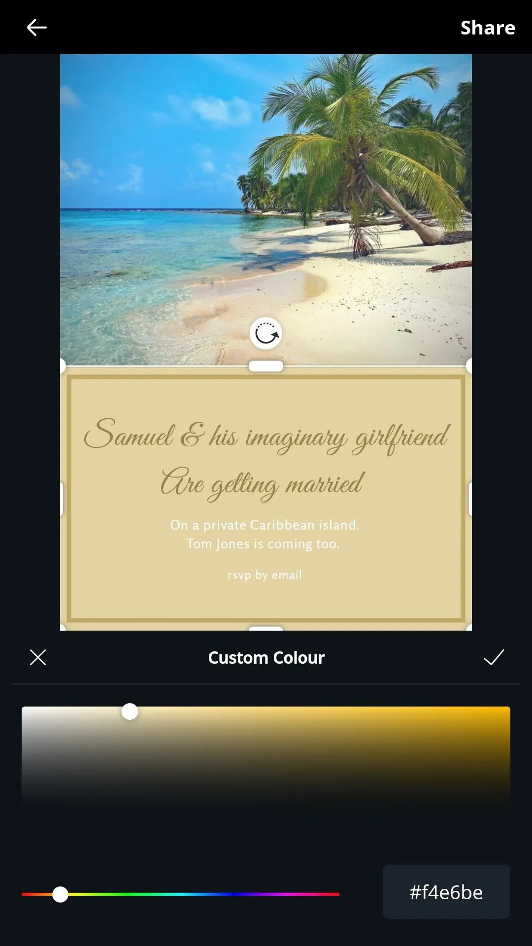
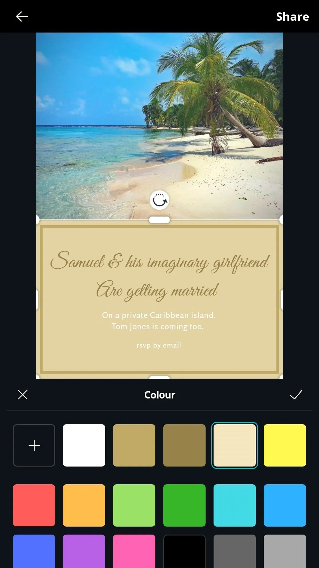


Contrasting hues will help make relevant text stand out and you should try to use colors that are not only aesthetically pleasing but fit well with the tone and purpose of your design. A pale blue, for example, will help to convey a more serene message, whereas an attention-grabbing red is more suited to stimulating designs that emphasize power.
An article from Creative Bloq offers some great tips for exploiting the use of color in your designs and how they can be used to elicit a different emotional response in the viewer.
Export & Share
With your colors set, the text in place, and everything else in order, your design is ready to be shared.
Select the share button, and you'll have the option to upload and send your completed design via your preferred application. All designs are automatically saved to Canva's cloud servers so you can always download or alter your work at a later date.


Tips for Better Design
Canva keeps things simple, but there are a few things to be aware of to ensure that your designs are as effective as possible.
While there are no hard and fast rules, it's probably best to take a less-is-more approach when starting.
Keep things clean and straightforward, with easy-to-read fonts and a contrasting color scheme that fits the tone you wish to convey, and always keep your target audience in mind. For example, if you're creating an ad, or a poster advertising a service or product, you'll want to think about the choice of color palette and font and how they can affect the viewer. It's generally recommended to use no more than three different fonts, and while bold typography is excellent for standing out, it can read a little loud and intrusive – probably not the best fit for a wedding invitation!
Canva's website provides a collection of learning tools and useful tips for creating all types of designs, including how to make amazing Facebook covers in 5 steps and this article offers some great design tips for non-designers.
- Follow Gadget Hacks on Pinterest, Reddit, Twitter, YouTube, and Flipboard
- Sign up for Gadget Hacks' daily newsletter or weekly Android and iOS updates
- Follow WonderHowTo on Facebook, Twitter, Pinterest, and Flipboard
Cover image and screenshots by Samuel Smith/Gadget Hacks














Comments
Be the first, drop a comment!