If you use the mobile Slack app, whether for work, school, or play, you know that the background color in discussions for channels, threads, and direct messages is white and that most of the text is black. Unlike with the sidebar, there's no way to customize the colors that appear here, but you do have one other option: dark mode.
Slack comes in two different color themes, light and dark. Light is the theme you're used to, with the white background and black text. Dark is the newer higher-contrast color theme, which reverses those colors for a near-black dark gray background with some medium gray elements and light gray text. Dark mode, sometimes referred to as night mode, has several advantages over light, which I'll talk about later.
Dark mode was released for the Android and iOS apps for Slack in March 2019, so before going any further, make sure to update your Slack app to version 19.3.1 or higher for iPhone or Android devices. If you're on Android and don't see the update yet, you can always enroll in the beta version to get access right away.
Using Dark Mode on Slack
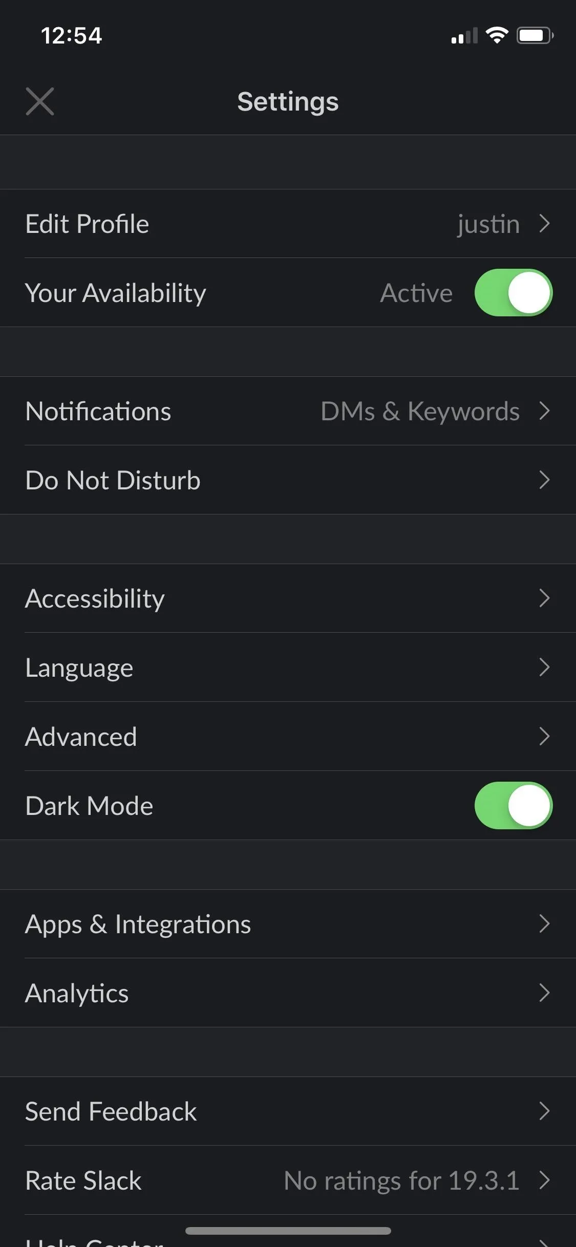
When you're on the right Slack version, tap on the vertical ellipsis (•••) in the top right, then select "Settings." Next, if you're on an iPhone, tap on the toggle next to "Dark Mode." It'd be in the third section right after "Advanced."

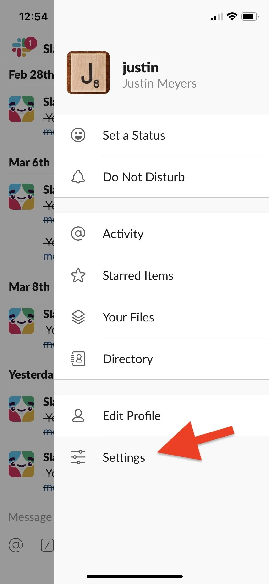
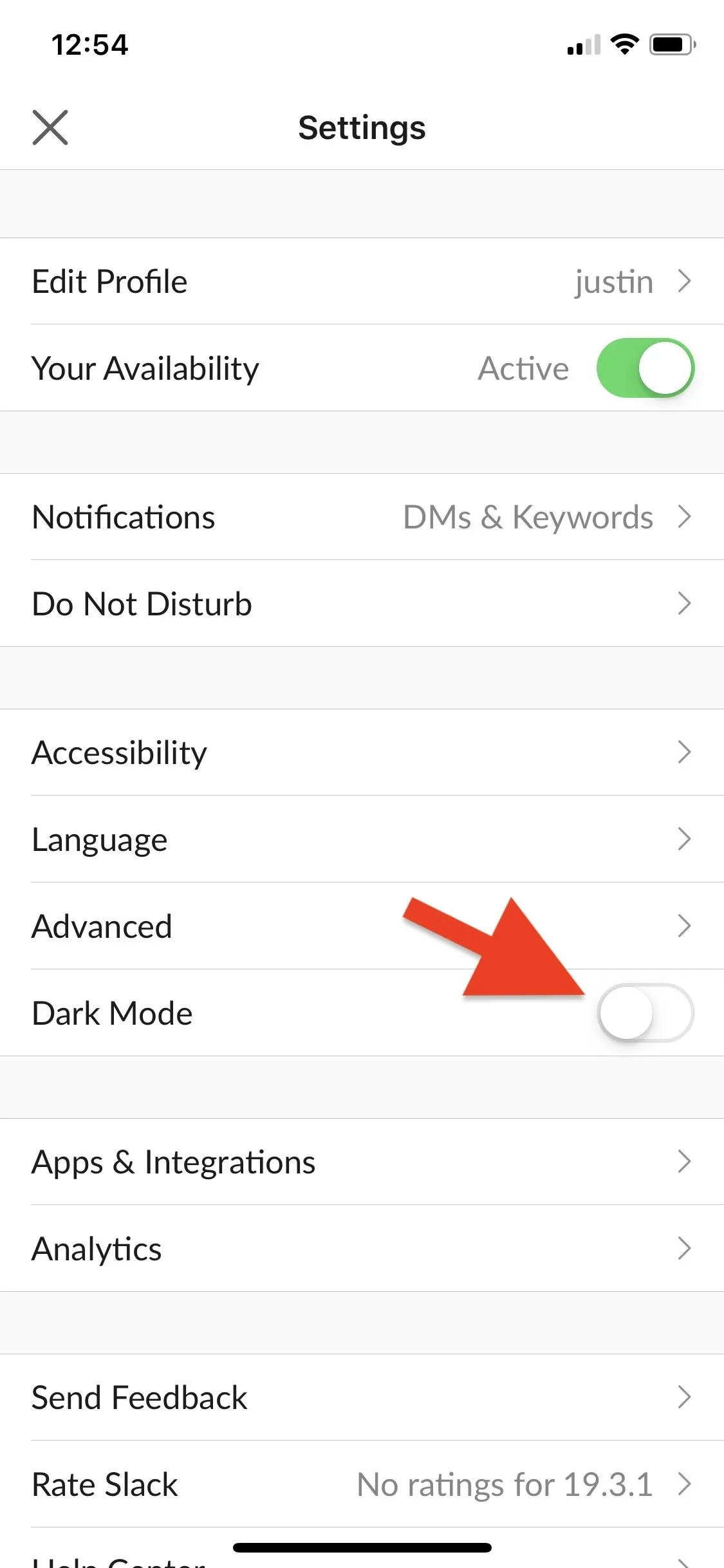


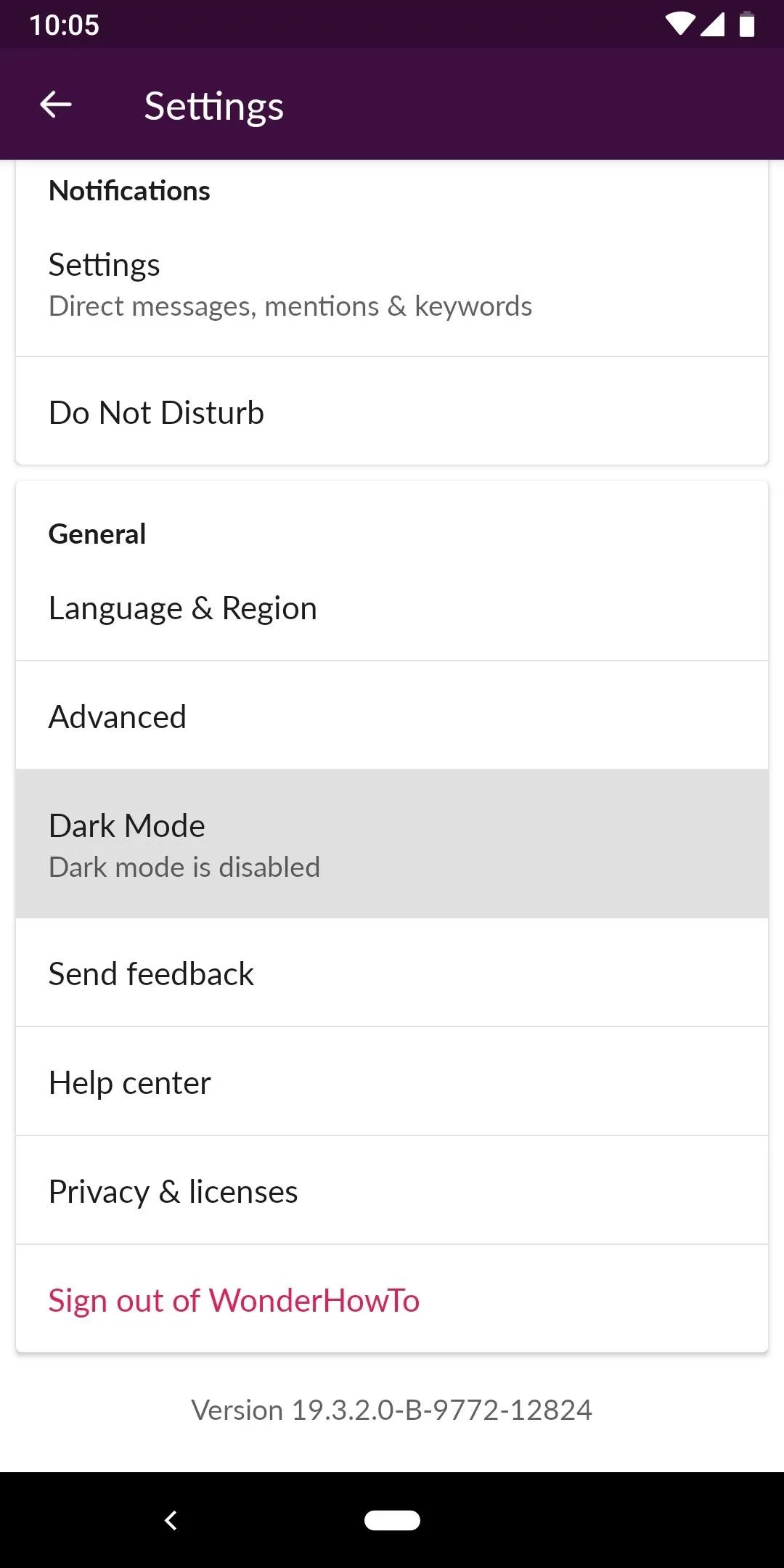
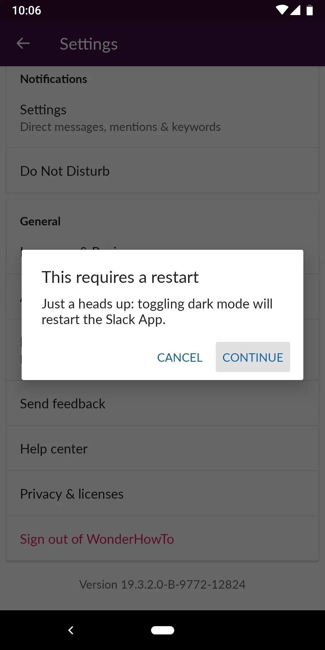
On an Android phone, it'd be in the General section, but it's not a toggle. Simply tap on "Dark Mode: Dark mode is disabled," and a pop-up may appear warning you that a restart is needed. Tap "Continue" if that's the case, and when the app is back up, you'll have the darker theme.


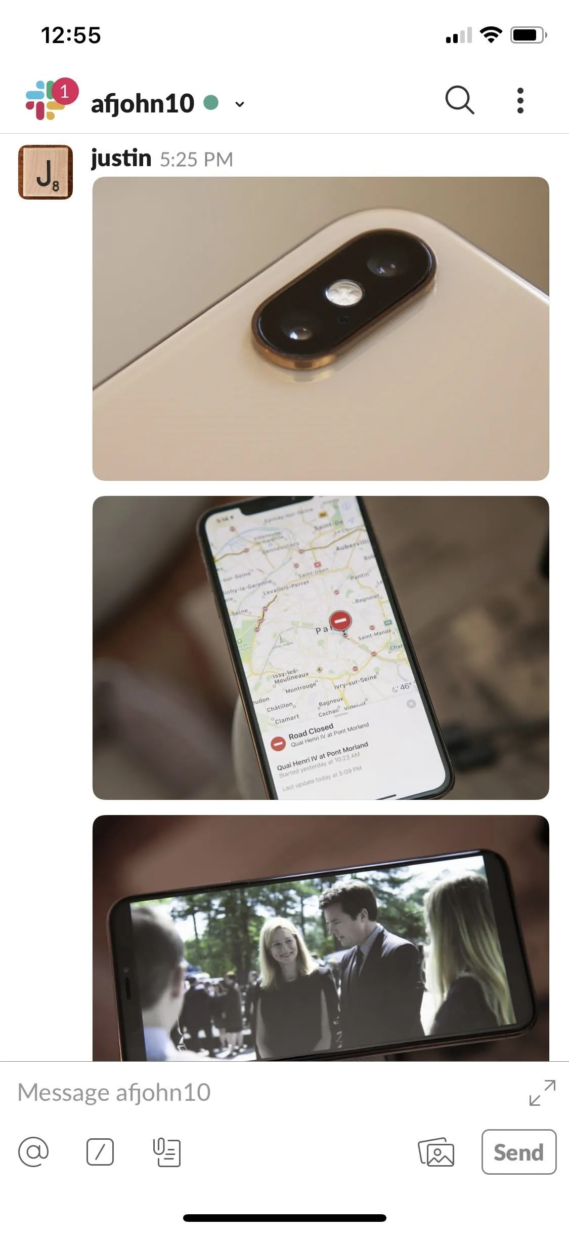
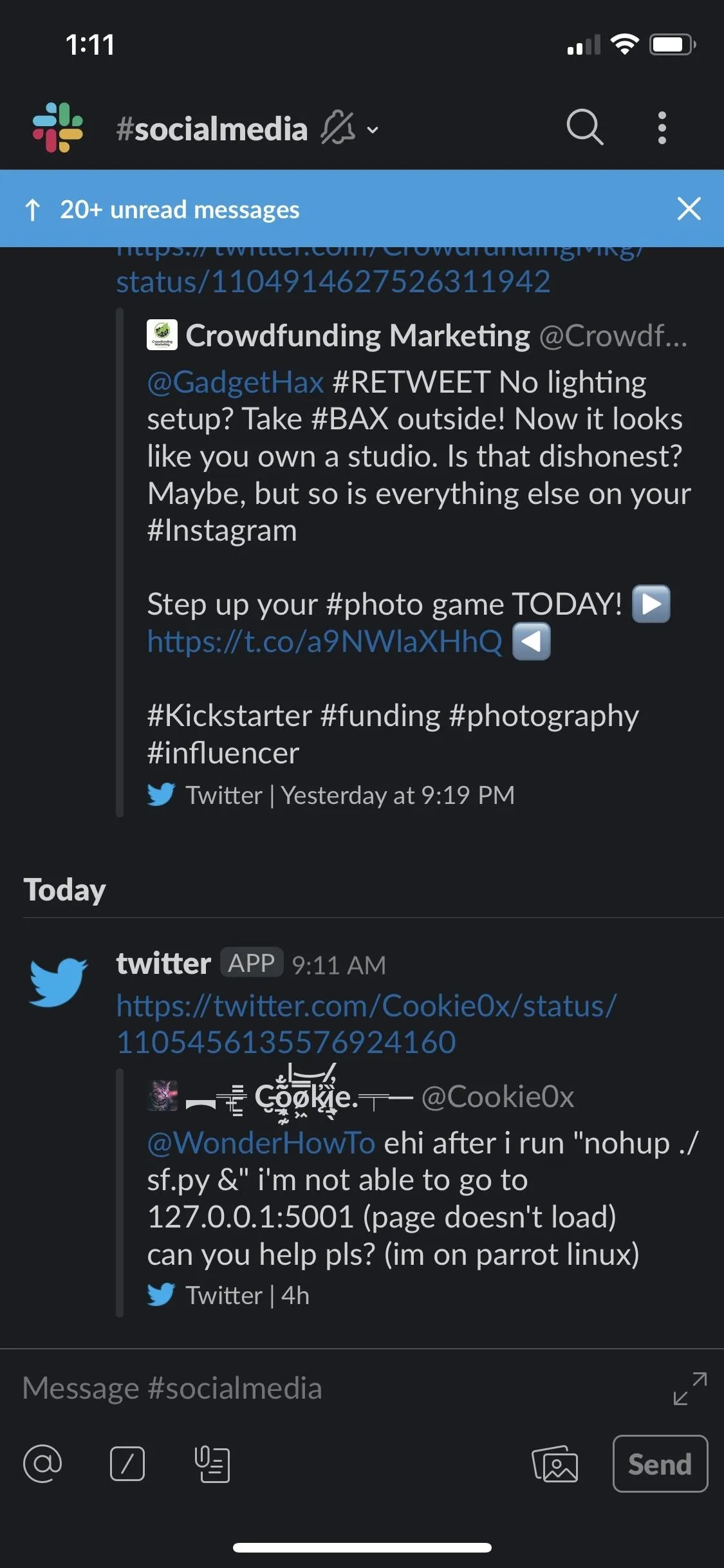
After enabling "Dark Mode," you'll see changes immediately. You'll see the super dark gray and medium gray backgrounds throughout the app, the text will be light gray, and links will still be blue.


Images will not be affected like in some inverted modes, so this is the real deal.



Why Dark Mode Is a Good Thing
First, it's easier on the eyes when reading and writing, especially in low-light conditions, so you don't get that blinding white straining your vision when you're in bed or up late. Second, it just looks cool, and it's another option aside from the default, and customization is always welcomed. Third, it can cut down on battery consumption on OLED screens.
When true blacks are used in dark mode, the pixels for those blacks are turned off, and when scrolling, then turn back on. Sounds good, but you could get an unintended fade when doing it that way, so a lot of dark modes bump up the color a bit to a dark gray, which still improves battery life on OLED screens.
The One Downside to Slack's Dark Mode
Something that won't be affected by Slack's new dark mode is the sidebar tray. The sidebar backgrounds and font colors will be whatever you set them to, whether a default sidebar theme like "Aubergine" (seen below) or custom colors you've chosen.
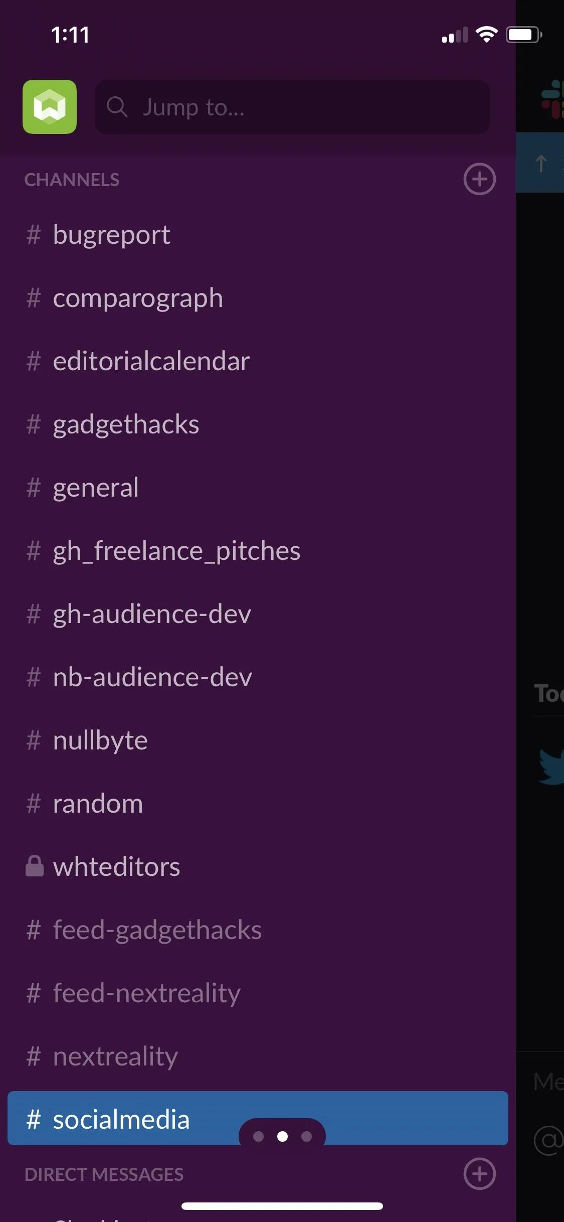
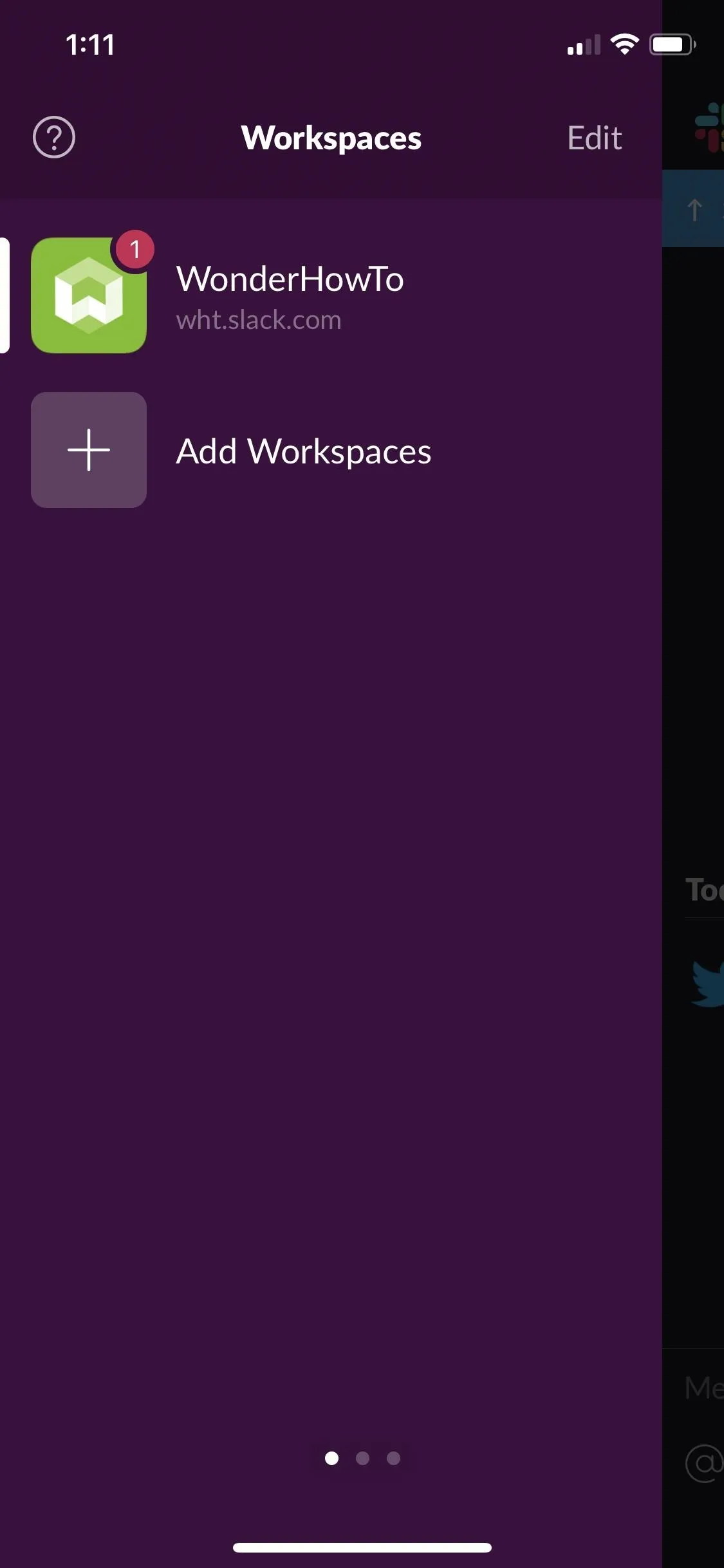


If you want to get the dark theme in the sidebar as well, you're going to have to design a custom theme with black or dark gray colors as the background and light gray text. Just keep in mind, unlike dark mode, changing the sidebar theme will change the theme across all of Slack's platforms — mobile apps, website, and desktop apps.
- Follow Gadget Hacks on Pinterest, Reddit, Twitter, YouTube, and Flipboard
- Sign up for Gadget Hacks' daily newsletter or weekly Android and iOS updates
- Follow WonderHowTo on Facebook, Twitter, Pinterest, and Flipboard
Cover photo and screenshots by Justin Meyers/Gadget Hacks












Comments
Be the first, drop a comment!