The smartphone market is stagnating. Without hordes of new users rolling in every year, the best way to boost profits nowadays is to poach customers from the competition. That's exactly what Apple appears to be doing with iOS 14.
As a longtime Android user, I'm genuinely intrigued by the iPhone's newest update. It's finally bringing a handful of features whose absence was always a dealbreaker preventing me from even considering iOS. If the shoe were on the other foot, this one would be a lot like Android getting iMessage.
1. Default Apps
I've said it a dozen times: I won't switch to an iPhone until Apple lets me pick my own default apps. Well, it might be time to start saying something else.
I'll get to iOS 14's "default apps" soon, but let me rehash that old argument one more time. Every major operating system lets users choose which apps perform which tasks. Windows, Linux, Android — even macOS. But not iOS.
That's just a dealbreaker. On Android, I can install any music app and set it as my default MP3 player. I can install a new phone app, a new texting app, a new camera app, a new search app, a new digital assistant, a new navigation app, a new browser, a new email client — hell, even an entirely new home screen app.

Just a little skeet taste of Android's default apps system. iOS 14 still has a ways to go.


Just a little skeet taste of Android's default apps system. iOS 14 still has a ways to go.

Combine that with the experience on desktop, and for our whole digital lives, Android users have been conditioned to always find the best app for every purpose.
So the problem can really be summed up like this: Which email app do I use on Android? The best one. Which email app do I use on iOS? Apple's.
iOS 14 is finally changing this. You'll now be able to pick your own browser and email app and the system will use them to open websites and mailto links. It's nowhere near enough, but it's something. It also signals a change in philosophy, because Steve Jobs' iPhone would've never let you pick your own anything.
2. Widgets
Apple will almost certainly never allow users to replace the iPhone's home screen with a third-party app. So our best hope has always been that they simply open up customization for it, and they finally have with iOS 14 — to an extent.
You still can't place icons wherever you want them (they're auto-arranged from top-left through bottom-right), but you can finally get something other than a square with rounded corners and some tech startup's logo on your home screen: widgets.
They're the real deal, too. It's an API third-party apps can use to populate data directly on the iPhone's home screen. It's not quite as rich as Android's — for instance, widgets can't have multiple distinct buttons or swipeable elements like a playback scrubber — so it's just live-updated data in a box. But they work and they're a HUGE first step towards home screen customization on iOS.


Apple's not even trying to hide the fact this feature came from Android, otherwise they would've given it a marketing name or called it anything other than "widgets." It's appeasing potential Android converts both ways. People like me who are used to widgets and wouldn't switch without them, or longtime iPhone users who see their Android friends' home screens and think of switching for the customization.
3. App Drawer
iOS 14 has a new dedicated home screen page all the way to the right named the "App Library." Call it what you want, but it's an app drawer, plain and simple — and that's a great thing if you've been using Android for awhile.
Some might argue that Apple's AI-powered auto-organization system for the App Library makes it more advanced or somehow different than an app drawer. But Android app drawers can smartly organize things, too. Take Google's App Suggestions as an example (I mean that's what Apple did, amirite).


4. Picture in Picture
Nowadays, both iOS and Android can keep apps running in the background while you go to your home screen and open another app. So they can both multitask by the technical definition of the term, but Android does it better with things like split-screen apps, bubble notifications, and picture-in-picture.
The lack of iPhone multitasking utilities has been a barrier for entry for a would-be former Android user whose phone serves more as a work tool. But Apple's working on bridging this gap, too.
For now, there's no split-screen mode on iPhone, but you can finally open videos in a floating player, aka, picture-in-picture mode. The popup player is even resizable, which is a feature Android couldn't boast until the latest version.
5. Incoming Call Notification
Continuing with the multitasking theme, iOS no longer hijacks your entire screen when you're using your device and get a phone call. A full-screen menu would take over whatever you were doing with a few sparse call-related options, but now, the UI is a simple heads up style notification with buttons just like Android's.

The popup incoming call UI on Android 11 (left) and iOS 14 (right)


The popup incoming call UI on Android 11 (left) and iOS 14 (right)

6. Assistant Overlay
Siri kinda just pops onto the screen now instead of taking over the whole display, which marks yet another big multitasking improvement. This is how Google Assistant has worked for years, and recently, the popup has become even more like an overlay to where this new Siri UI is very similar.
If you watch them in action side by side, it's hard to believe the one on the right didn't at least draw heavy inspiration from the one on the left.
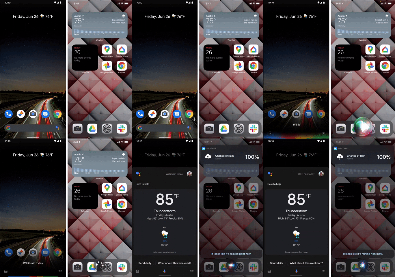
Google Assistant on Android 11 (left). Siri on iOS 14 (right).
7. Pinning Contacts
This isn't so much a UX improvement as it is a UI similarity, but it should definitely help former Android users feel right at home. iOS 14 now famously allows you to pin people to the top of Apple Messages for easy access to your favorite conversations — and it looks just like pinning people to the top of Google Phone on Android.
- Don't Miss: How Pinning Works for Messages in iOS 14


8. Previewing Apps That Aren't Installed
The iOS App Store is a bit more restrictive than the Google Play Store. Just installing an app is more cumbersome — you have to scan your face or fingerprint to verify your identity before you can even install a free app. But this is changing in iOS 14 thanks in part to another longtime Android feature: App Clips.
Really, this one is a combination of two Android things: Instant Apps and App Slices. The former allows Android users to launch links with compatible apps even if the app isn't installed — a sort-of live preview of the app. The latter lets apps surface rich elements from within themselves in other apps, and now App Clips is bringing both functionalities to iOS.
Cover image, screenshots, and GIF by Dallas Thomas/Gadget Hacks










Comments
Be the first, drop a comment!